Its that time of year when popular paint companies announce to the world their “Color of the Year for 2019”. If you like the Pantone system, Benjamin Moore and Sherwin Williams paints, then you need to read this!
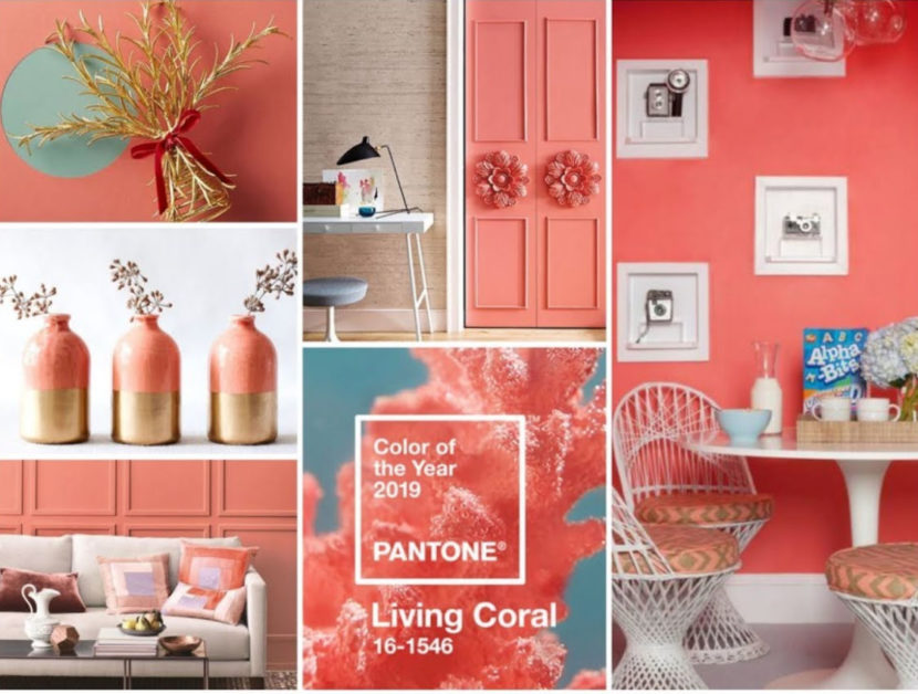
‘Living Coral’, aka Pantone 16-1546, has been named color of the year by the renowned color matching system Pantone.
Described as “buoyant, vibrant and effervescent”, the marine tone is predicted to dominate the design industry over the next 12 months.
Although this is exciting and we look forward to watching retailers add this color to their lines of furnishings we can’t help but still be in love with the blush colors we saw a lot of in 2018. Its OK to keep them near and dear this year; we don’t see them going any where. But coral IS going to be everywhere this summer.
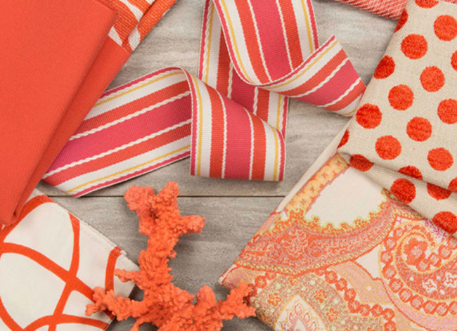
Kravet, one of our favorite fabric sources, has new coral hues that were inspired by this 2019 color. If you are looking for this color palette we can get it for you! Check out more of Kravets beautiful fabric offerings here.
Benjamin Moore has chosen a much less bold color as their 2019 Color of the Year.
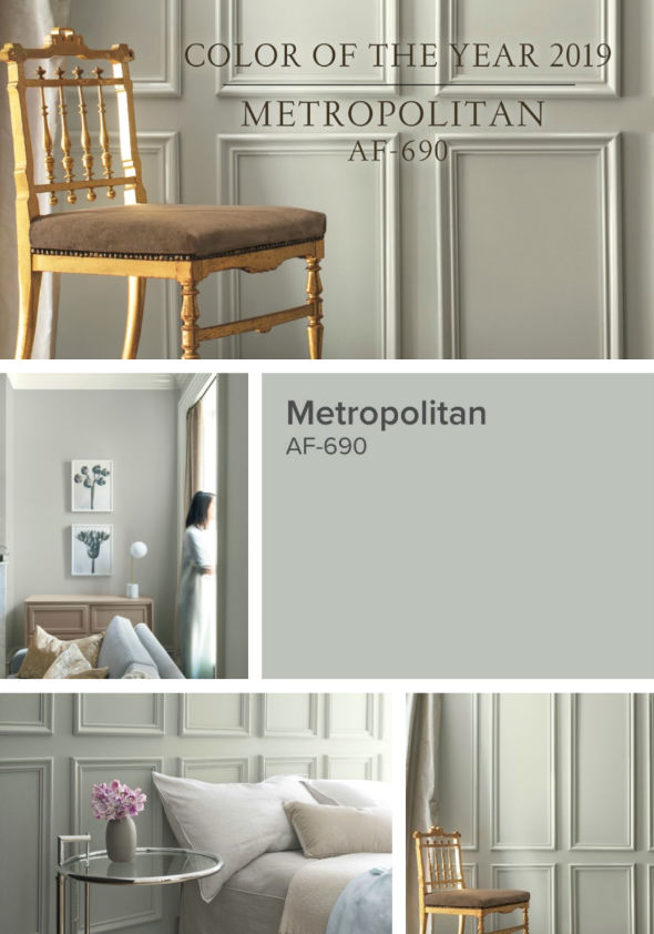
Calm, composed and effortlessly sophisticated, Benjamin Moore’s Color of the Year 2019, Metropolitan AF-690, exudes glamour, beauty and balance.
It is actually a really good neutral with a modern flare and creamy warmth to it.
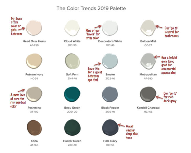
Benjamin Moore has a new list of 2019 Color Palette Trends. We were excited to see a number of them that have become Love Your Room’s very own popular ‘go to’ colors. Here is that list, along with a few notes of specific paints we are fans of.
Sherwin William has also picked their 2019 Color of the Year.
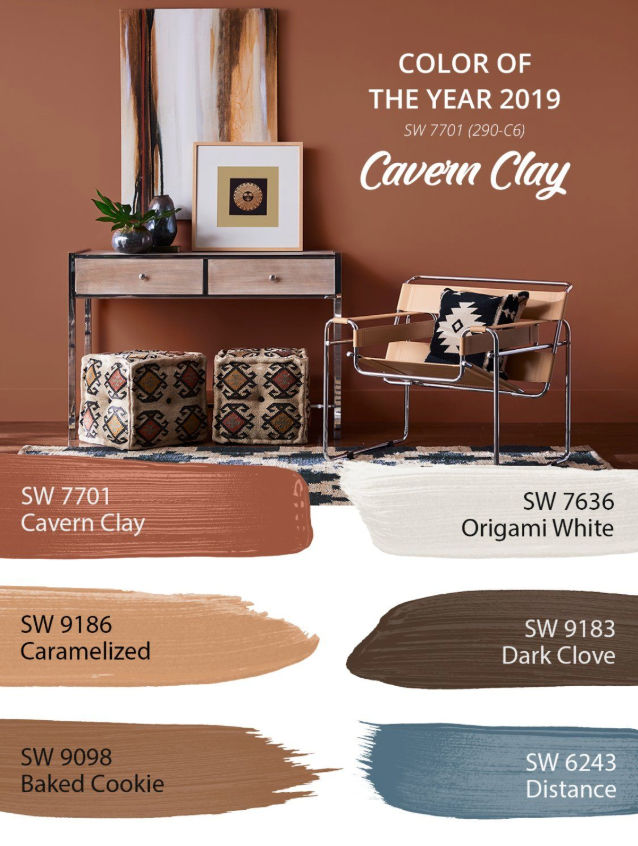
They describe it as “Forged by sun. Fired by desert. Introducing Cavern Clay SW 7701, the 2019 Sherwin-Williams Color of the Year. Ancient, yet fully alive. Bohemian, yet totally refined.”
This clay color can give a warm rustic vibe when paired with creamy beige colors. Perfect for the very hot boho vibe we are seeing. It can also look more modern when paired with light grey colors. We caution you to use it sparingly thru accents walls and accent décor like rugs, pillows, vases and planters, and window treatments. Too much of it can create a dark room.
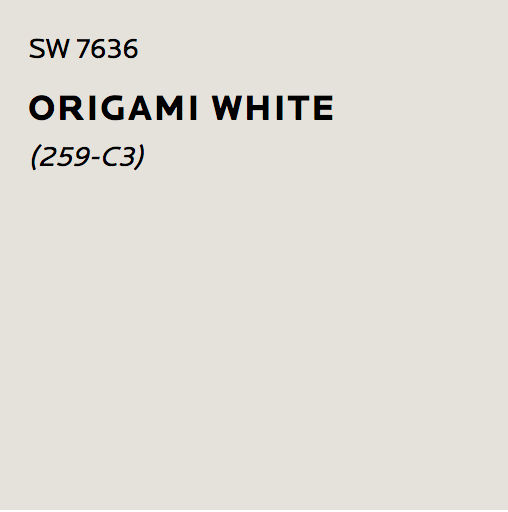
Sherwin William recommends pairing it with Origami White (SW 7636) and we agree! We love Origami White! It’s a wonderful main neutral color to use. And it lets any bold color like Cavern Clay, shine!
Have fun with the colors, and remember to always test your paint on your wall before committing to a color. All those photos you see online using the colors you like may not look the same in your room due to lighting and photography. Save yourself money and stress by testing your color out first.
Check out some of LYR’s recent project here.